An incomplete picture
How can we properly address challenges related to inequalities between men and women when the data that reflects these problems is so poor? There is a significant lack of sex-disaggregated data which spans many important indicators of economic, physical, and social well-being, which results in an incomplete picture of the reality of women's and men's lives.
In a report made by the World Bank they explained that a perpetuating factor of the significant gender gap experienced is the lack of sex-disaggregated data. This data gap results in an incomplete picture of the reality of women’s and men’s lives.
According to the World Bank it is important to address these data challenges in order to address the overall problem of extreme poverty and to improve agency towards overall prosperity. We would submit too; it is necessary for designing the kind of fairness we would like to see realised in the world more broadly. As the Researcher Caroline Criado-Perez noted in her book Invisible Women:
“There is a better way. And it's a pretty simple one: we must increase female representation in all spheres of life.”
The consequence of this data gap is a severely limited ability to predict outcomes and plan interventions. Another major negative implication is that it makes it very difficult to advocate for policy and societal changes that might improve conditions for women without this data.
In a study done on sex-disaggregated data in African countries, it was found that only twenty percent of the countries that took part in the research were able to produce a satisfactory level of data that could be used to construct a time-series of sex-disaggregated data.
More inclusive data in Civic Tech
As civic-technology practitioners, we like to build and maintain strong relationships with our data, this often tends to be in many ways a love-hate relationship:
- We love data because we see its significant value to create sustainable solutions to everyday issues.
- With all these grand master plans, there’s always the one project that got away. Or the datasets we could not open. This is when the hate comes in, just as impossible as it is to build a visualisation without data, it is as pointless to build it without the relevant data. Sometimes the biggest challenge we experience in presenting inclusive data is finding that inclusive data.
Quite simply, we become frustrated by our inability to tell the stories we know matter, because the data that drives those stories is not adequately available. Yet, despite numerous challenges experienced in the South African landscape, we are constantly evaluating available tools, and seeing how we can incorporate more sex-disaggregated data. In recent times we have developed a few visualisations and articles that speak to the problem at hand.
Please have a look at some of the articles that we have written that grapple with this subject.
Age, gender and unemployment in South African municipalities: Revealing the disparities using data
What's the real impact of COVID? Making a case for sex-disaggregated data.
Through researching these article as well as through our work we have learnt a lot about exploring and visualising sex-disaggregated data. Here are some tips that we think you can use to improve your visualisations with inclusive data:
1. Lights, camera, context
It’s true that we can’t wave a magic wand and make data inclusive, but we can and should make a point of acknowledging the current exclusions made in the data. This means doing the research and acting as advocates for improved procedures of more inclusive data collection.
2. We are all in this together, so develop inclusively
The key to making visualisations more inclusive is by including those (excluded) people in the development process of these visualisations. I almost felt silly writing that but it's true (and often overlooked) - inclusive data visualisations should not be developed in isolation by developers and data experts but should rather be tested widely with the public to ensure that they are representative and inclusive of all those it is attempting to portray.
3. Out-of-the-box Visualisations
Whenever faced with a challenge, the common solution is: get creative. By this we mean to use non-restrictive visualisation tools to show your data. Consider upgrading bar graphs and pie charts (which can constrict smaller datasets) to stacked-area charts and treemaps. Feeling brave? Consider moving your data to more interactive visualisation tools like Google Data Studio or Microsoft Power BI. This is a great way of displaying large data sets, highlighting key differences, and people get to play around which increases engagement.
4. Be a 'Data Hunter' and a 'Data Gather'
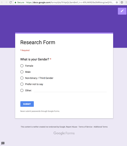
If the data doesn’t exist, collect it. Sometimes in order to present inclusive data the only option is to collect it; this can be done using a number of digital tools provided for free. Google Forms, AirTable, KoBo Toolbox, Otter.ai, and TypeForm are a few of the important data gathering tools we make use of daily.
Completing the picture
This article clearly articulates the importance of having sex-disaggregated data and highlights some important tips and tools that can be used to improve inclusivity when developing data visualisations portraying the economic, physical, and social well-being of both women and men.
OpenUp is committed to keeping our organisational processes and methodologies as transparent as possible. With this in mind, if you are interested to find out more about some of our projects. Please let us know at jonathan@openup.org.za.


